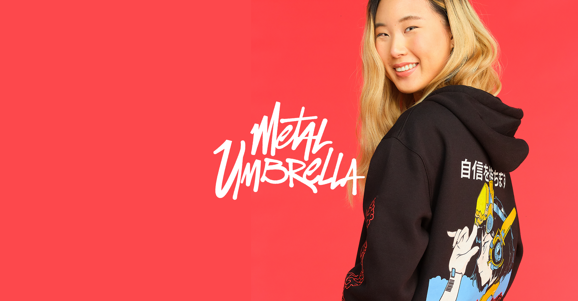
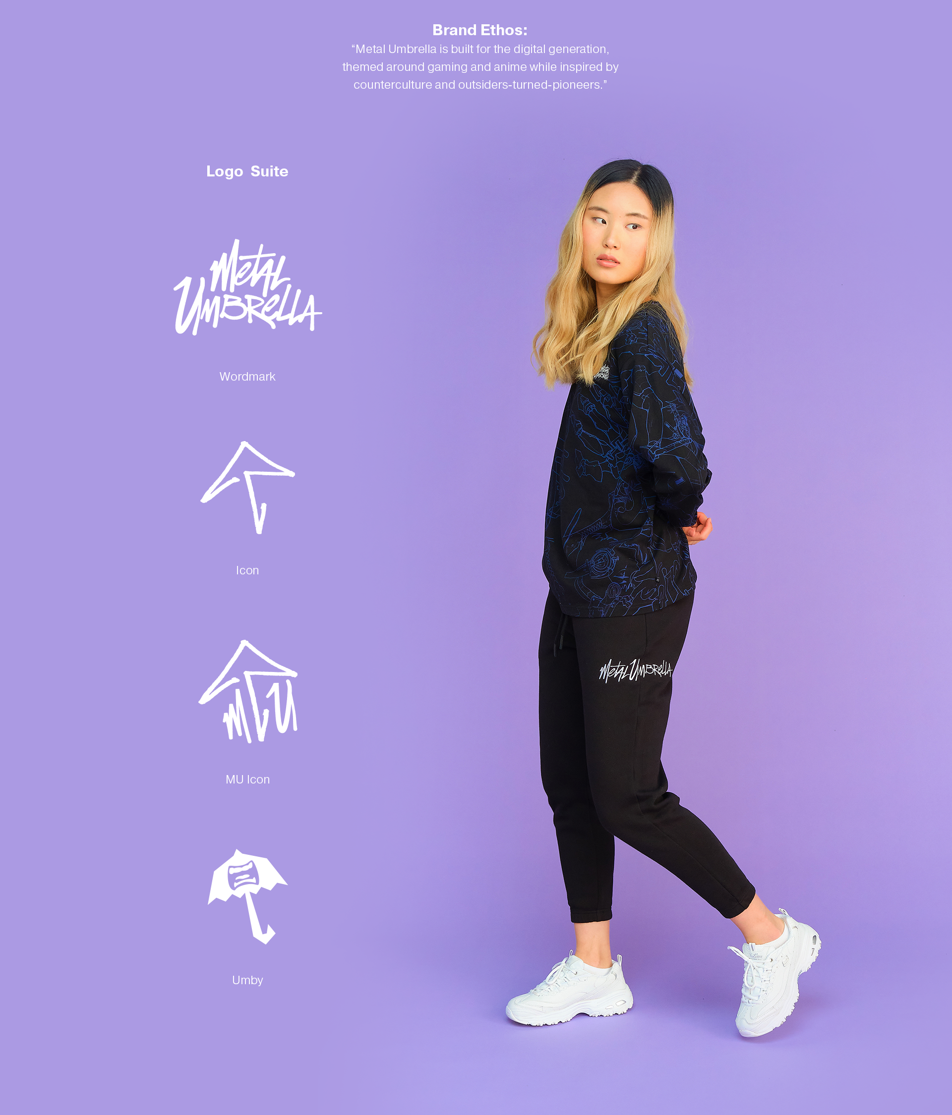
Metal Umbrella
Oni Studios didn't want another gaming-merch line. They wanted a streetwear label with a spine, something that could hang in a shop next to brands that had never touched a controller and still earn its place on design alone. That was the brief, and the open-endedness was both the opportunity and the risk.
Streetwear is unforgiving. A mark that reads as merch is finished before it reaches the rail. Lean too heavily on the gaming roots and it feels like a licensing deal; push too far from that world and it loses the reason it existed. Every decision had to feel like it came from a fashion label.
I came in on brand strategy, helping pin down what Metal Umbrella actually stood for before a single garment got drawn: the attitude, the rules, the logic for why a piece belonged or didn't. Then I moved into the visual system as one of the principal designers, shaping the marks, the type treatments, and the graphic language.
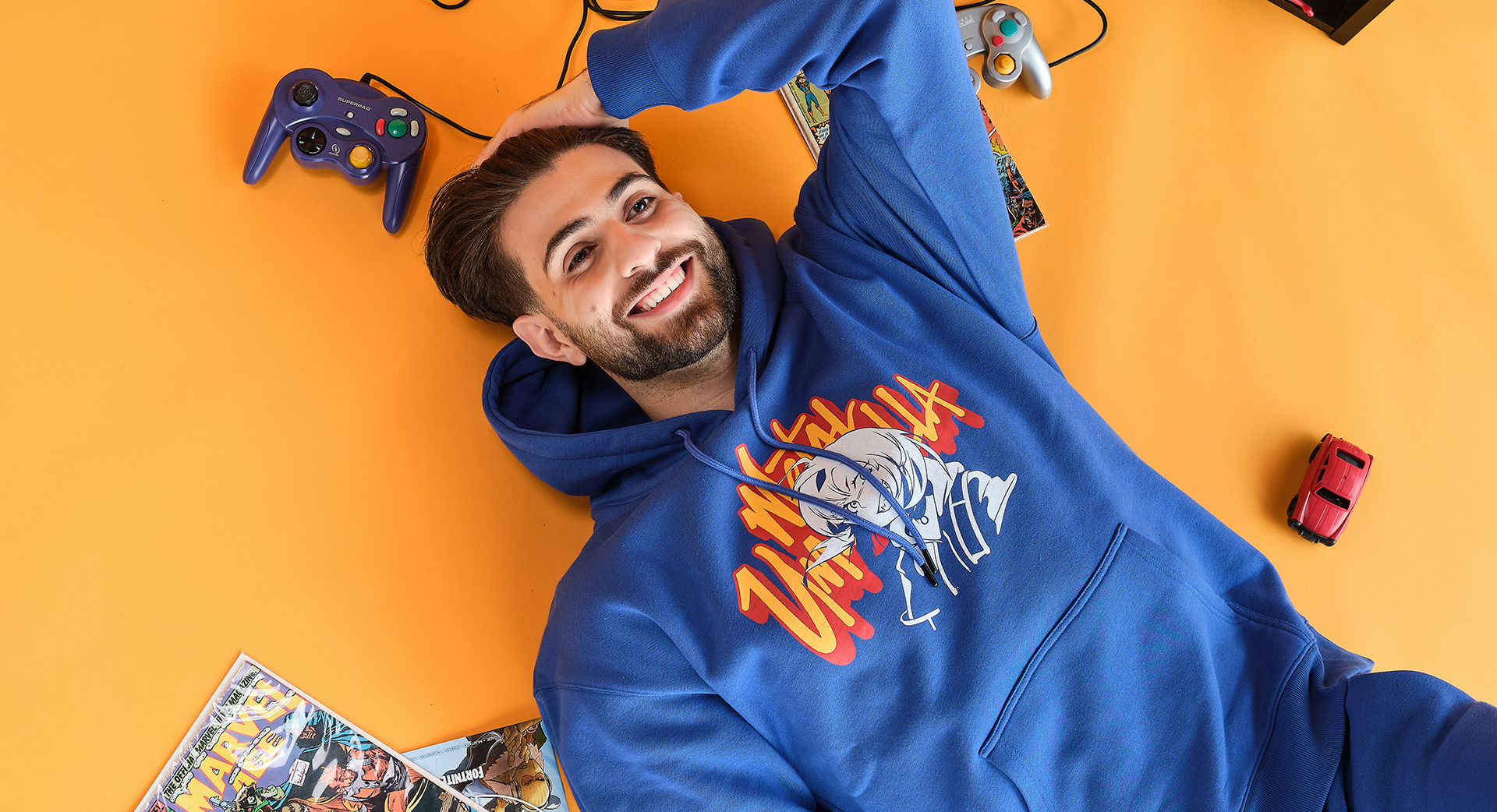
In apparel the details carry the whole thing: weight, spacing, the confidence of a single line. The throughline was restraint. The easy move would have been to lean on the gaming heritage and put a mascot on a hoodie, and we refused. Metal Umbrella had to earn credibility on design alone, which meant killing the obvious ideas in favor of quieter ones that held up on a second look.
A logo that reads as merchandise is dead on the rack. Every choice had to feel like a label, not a licensing deal.
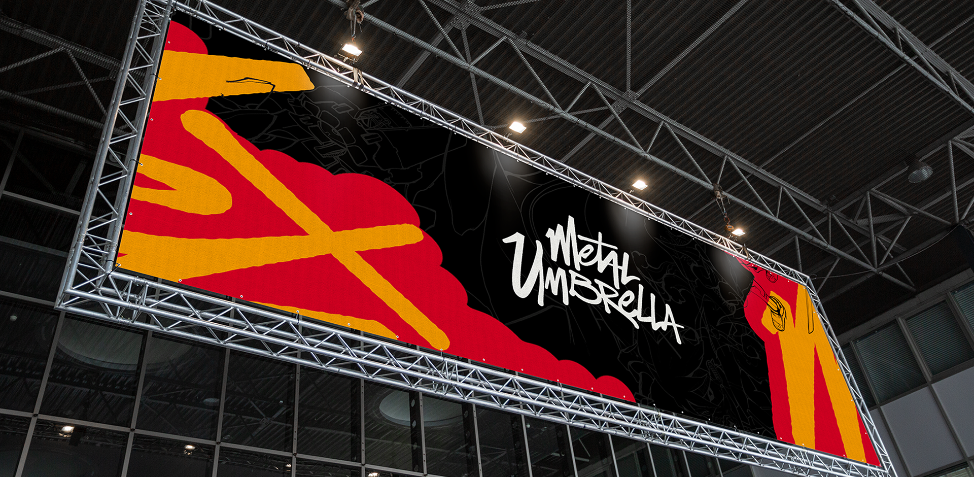
What shipped was a brand that didn't hide where it came from but didn't depend on it either: a streetwear system with enough structure and attitude to stand on a shelf on its own terms.

.png)