SKHQ
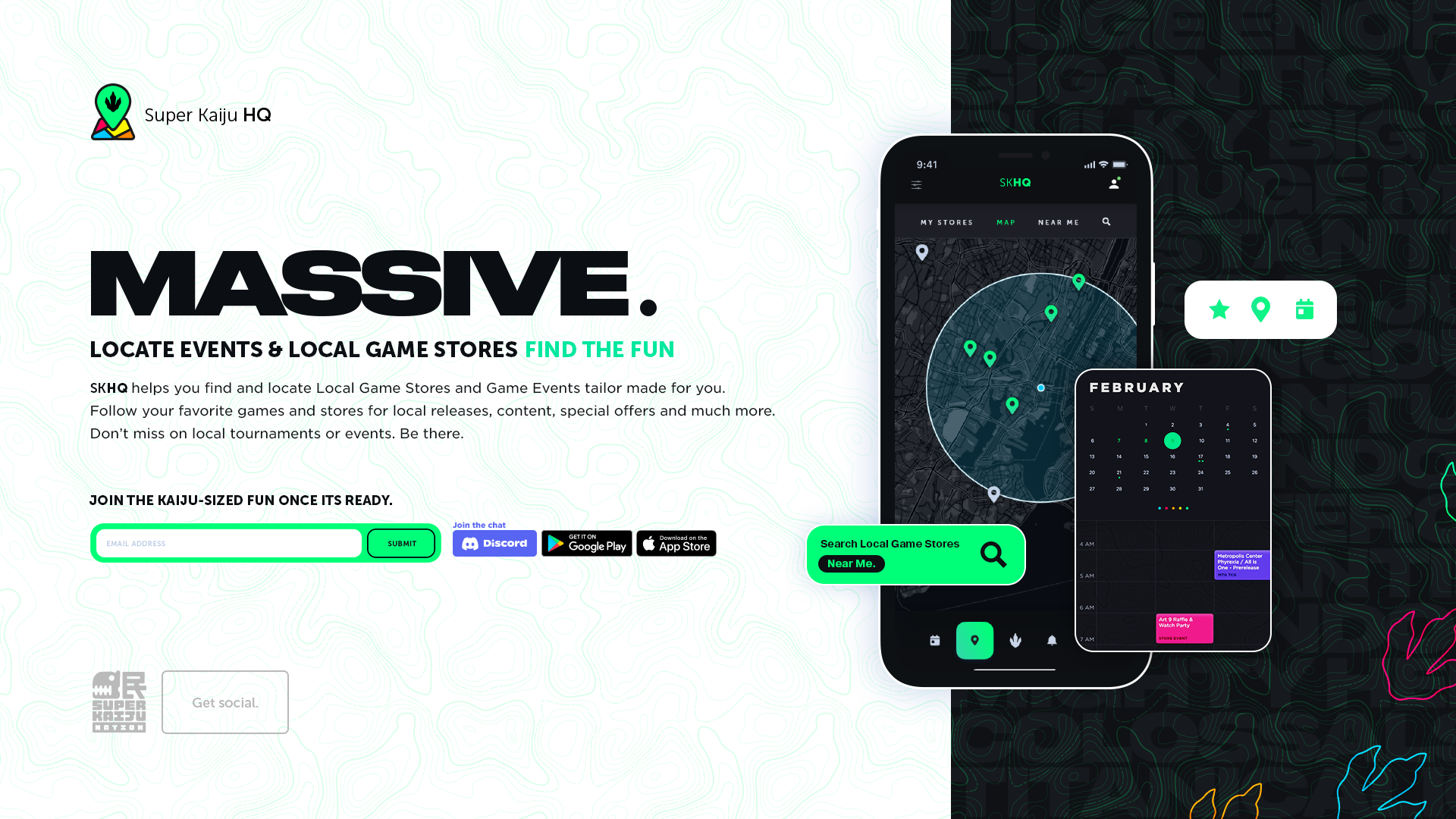
Modern tabletop and trading-card games have huge, devoted communities, but they live scattered across local game stores, group chats, and event calendars. SKHQ set out to give them one home: a hub for events, tournaments, store locations, and trades, built with the kind of branding and distribution polish this space rarely gets.
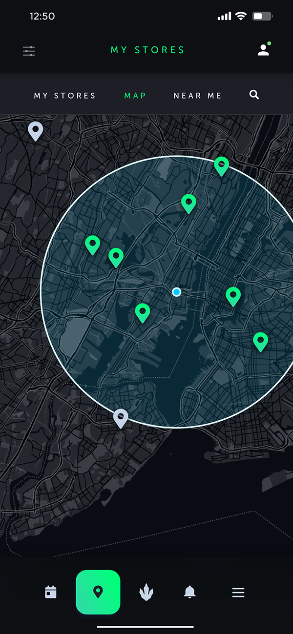
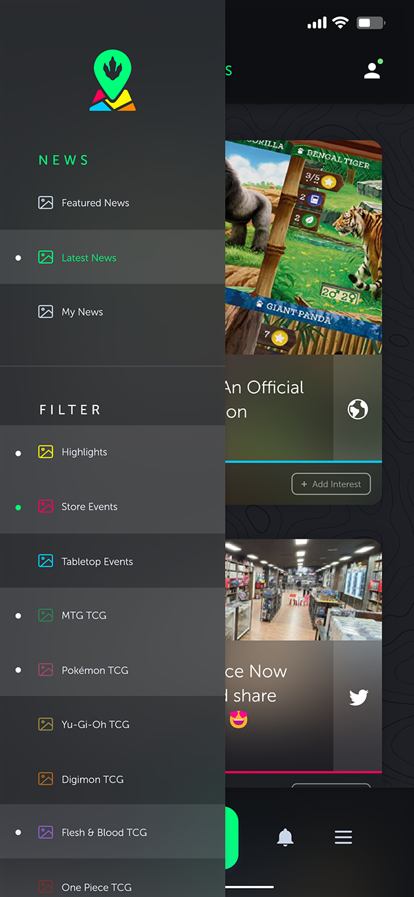
The real problem was bringing modern branding and distribution to a vertical that rarely gets either: modern tabletop games and TCGs. The culture runs deep — the local game store is its clubhouse, and weekly tournaments, league nights, and trades are how people belong — but it's fragmented across stores, Discords, and scattered event listings. SKHQ had to pull those threads together without flattening what makes each game and each shop its own thing.
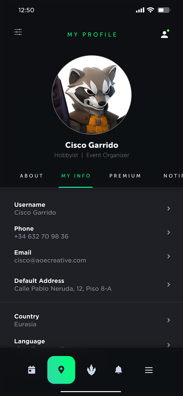
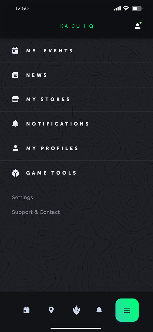
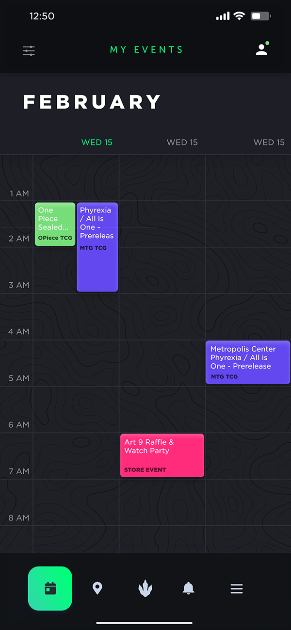
I led creative direction across the department and worked hands-on through identity, UX/UI, and visual design. The job was less about a logo and more about shaping a product: how a player finds a store, joins an event, lines up a trade, and feels part of a scene the moment they open the app.
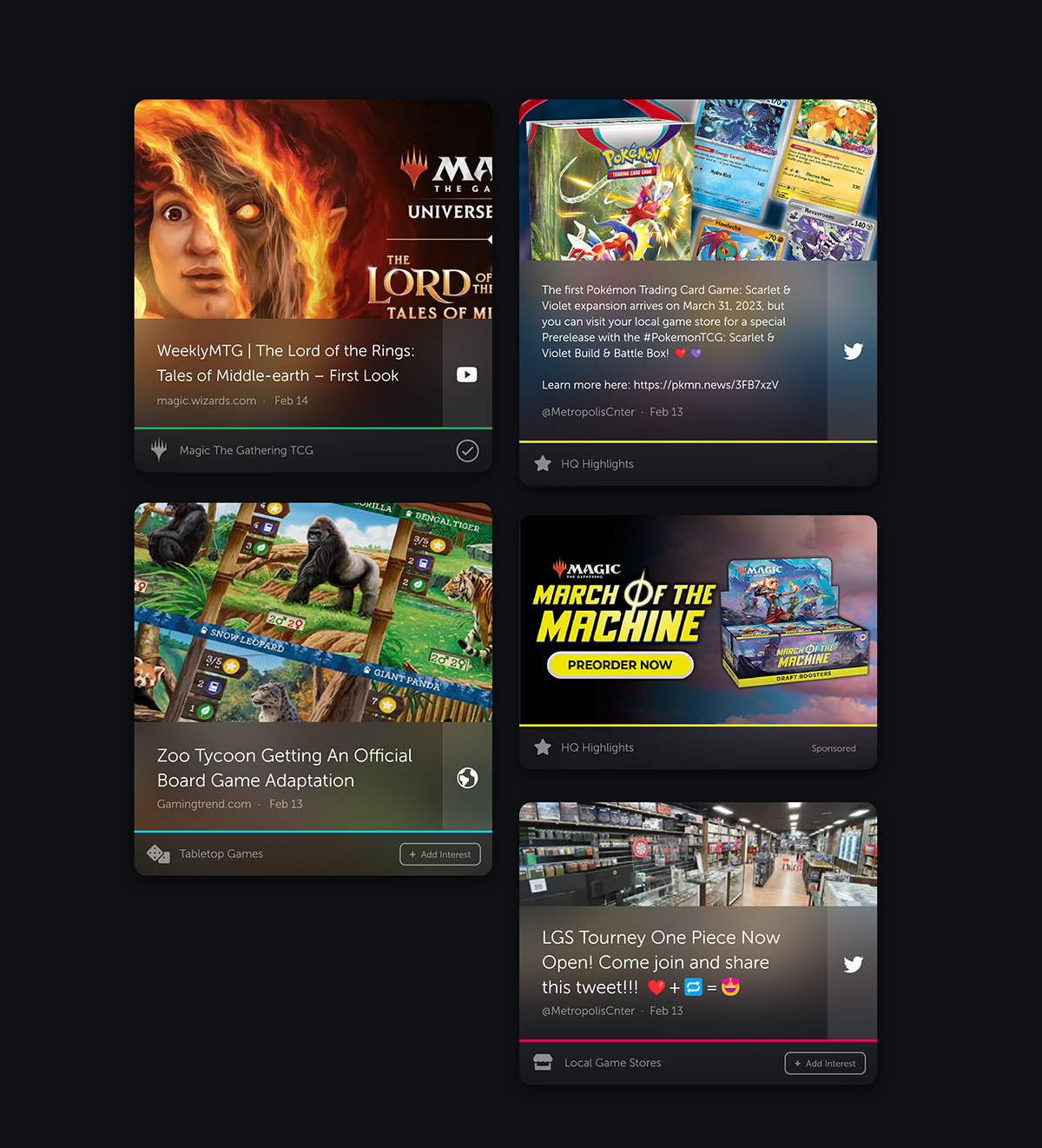
We wanted something bold and colorful, with enough personality to feel like a community space rather than a utility. But the interface had to know its place: in a world full of gorgeous card and game art, the UI can't compete with it. So I kept SKHQ's own visual language confident but restrained, a frame that lets each game's aesthetics lead while the hub — store finder, events and tournaments, trades — stays clear and quick to move through.

One home for a scene that didn't have one: a hub that points players to stores, events, and tournaments, and gives these communities a place to find each other. SKHQ is the clearest example of what I deliver across the full creative stack — not just how a brand looks, but how it behaves and what it's actually for.