Immortal · UI/UX
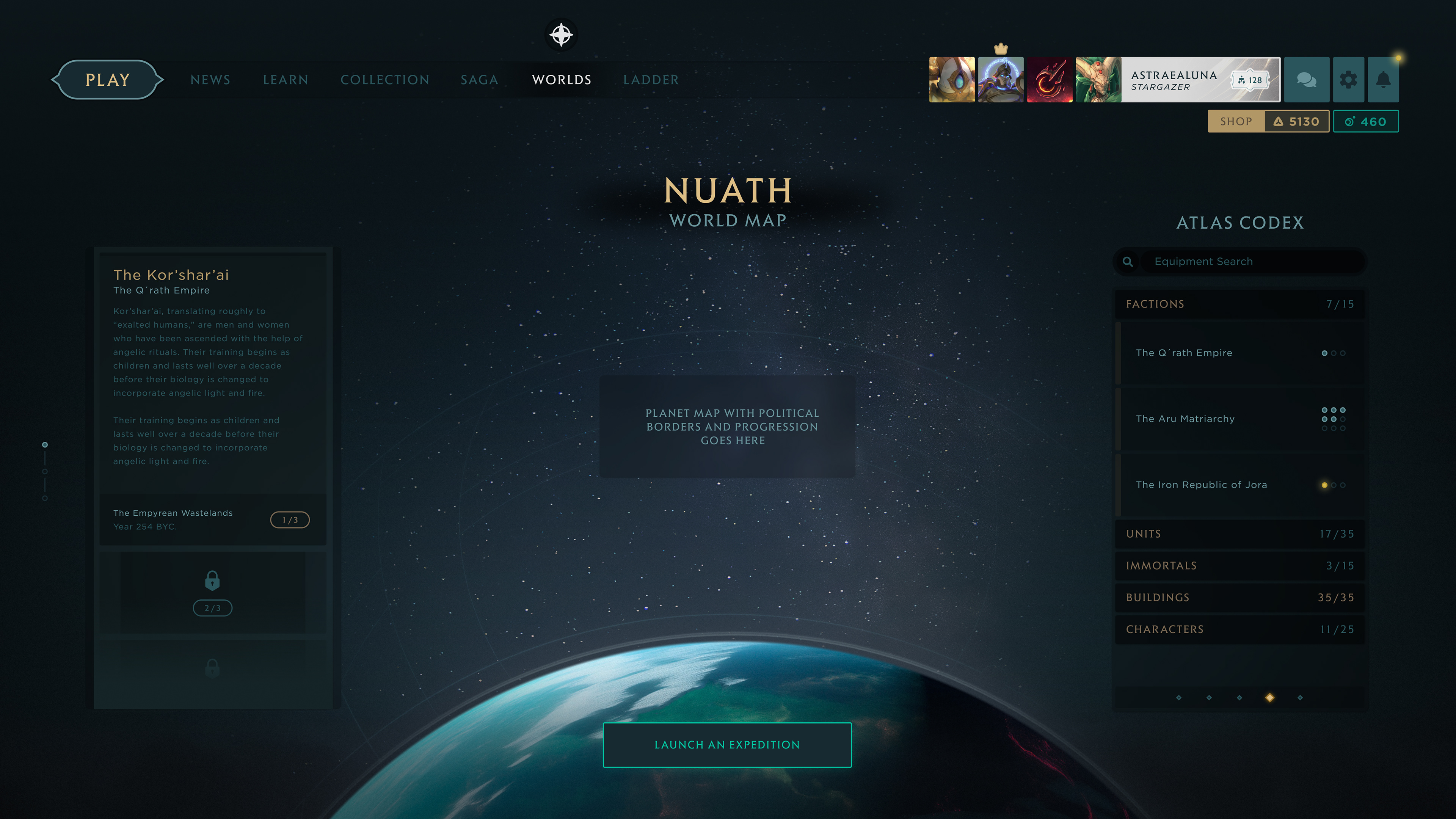
Having built Immortal's brand world, I was brought back in for a second engagement, this time on the game's interface. A shorter stint, but a focused one: directing the UI/UX strategy and serving as principal designer for it. Returning to a world you helped create, now to design how players move through it, is a rare kind of full circle.
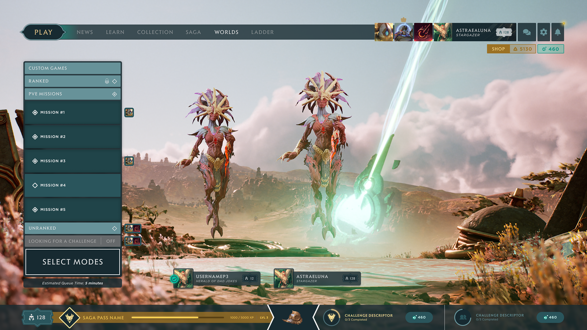
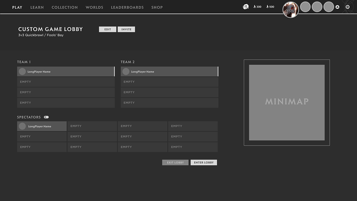
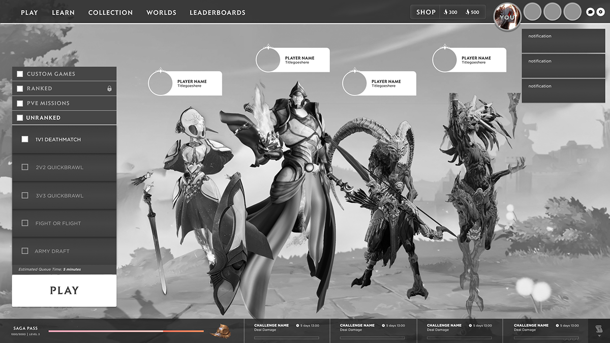
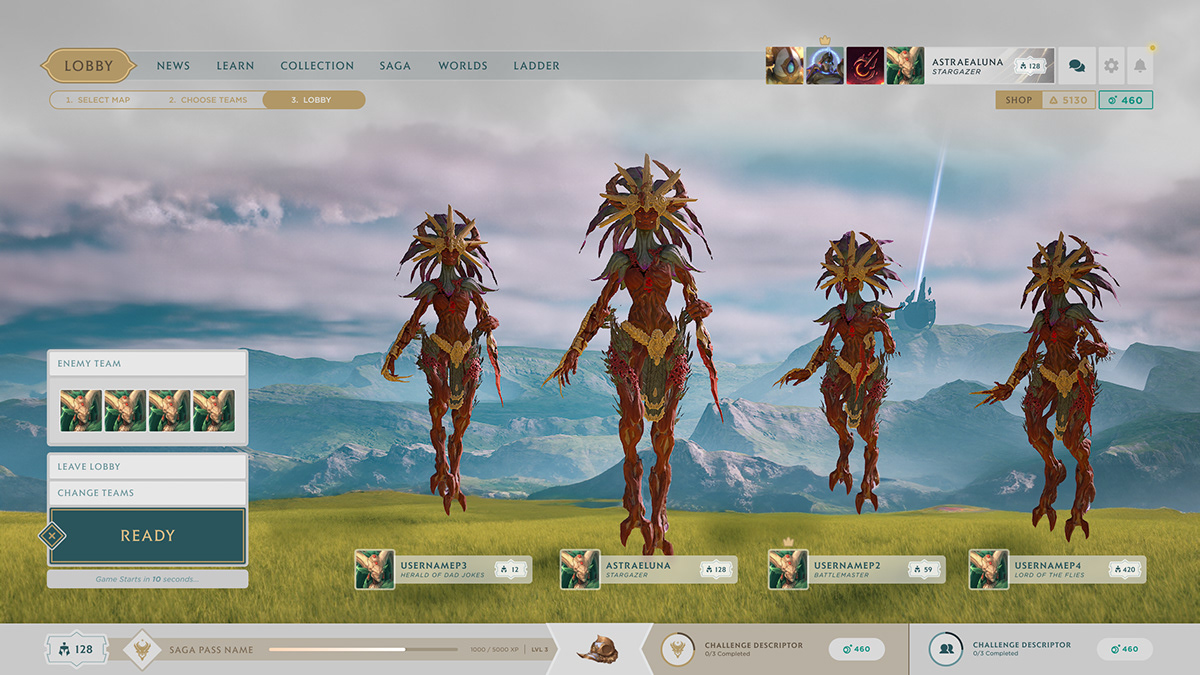
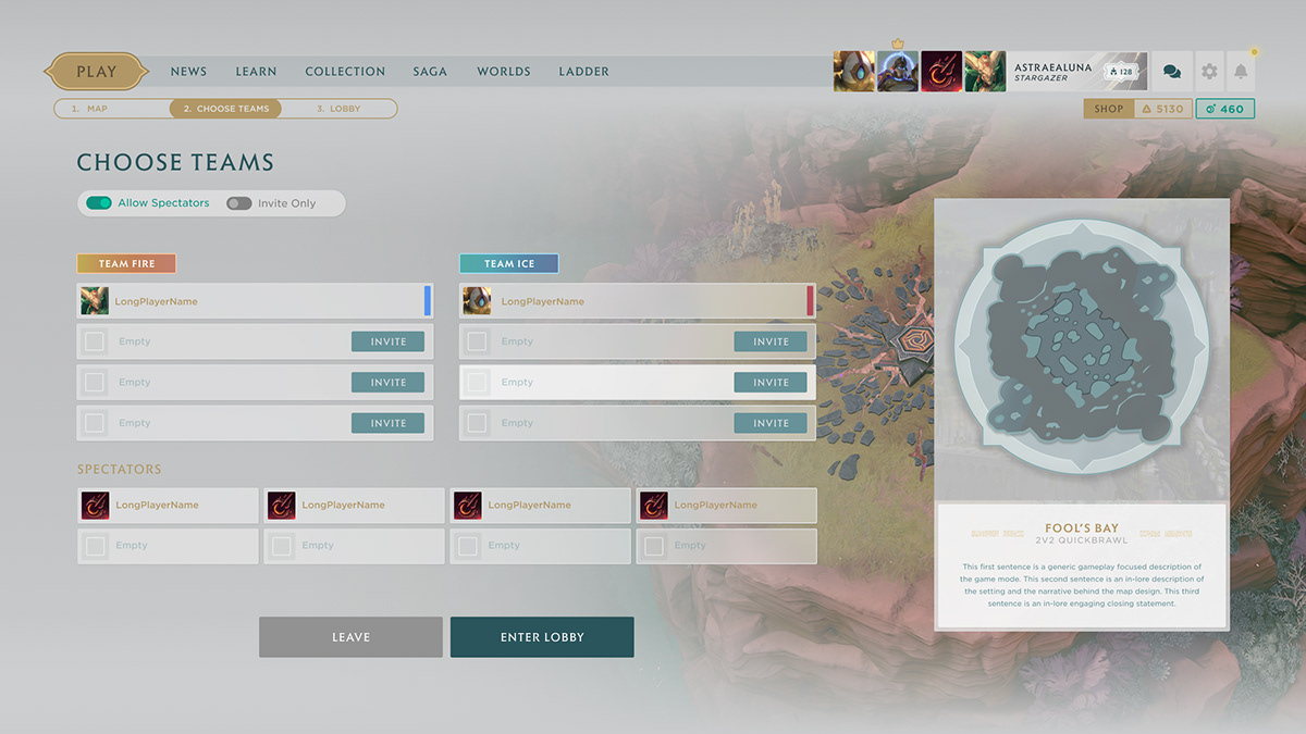
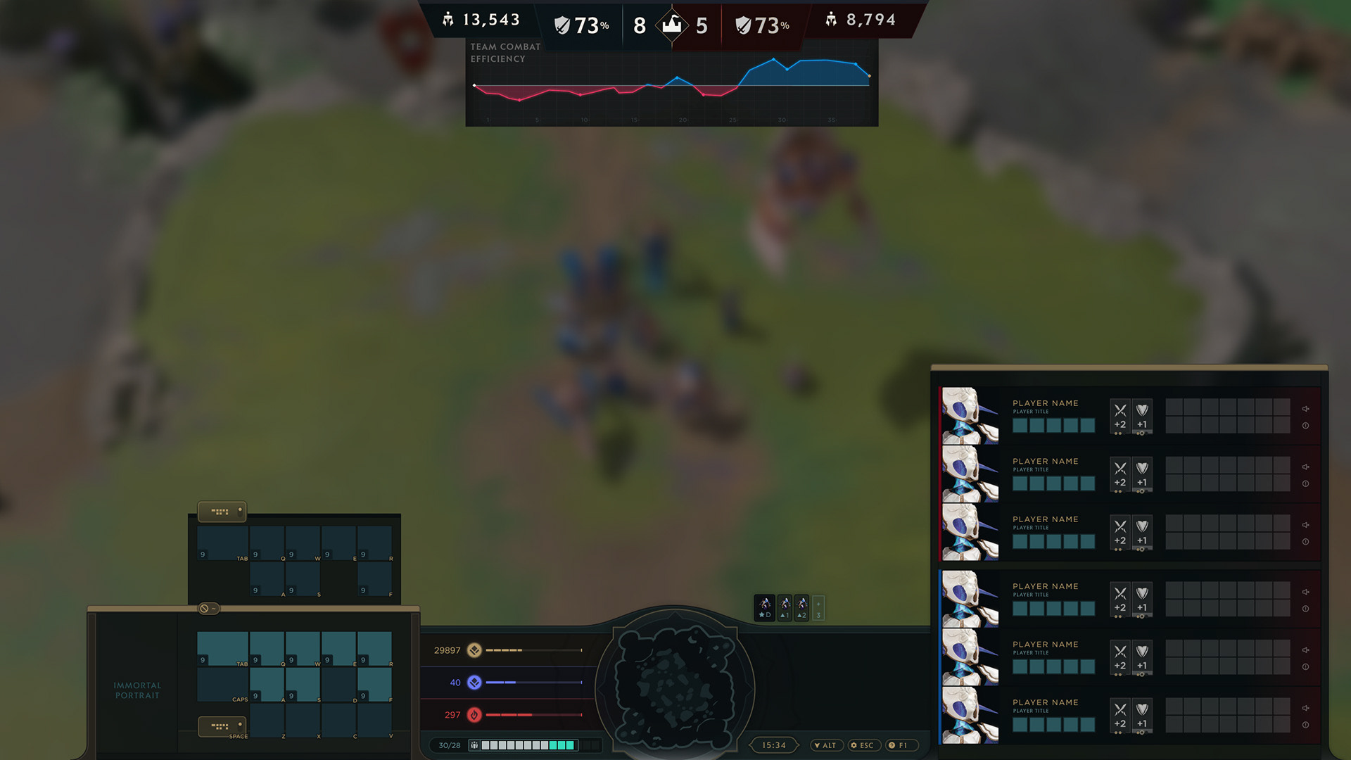
Game UI is a hard discipline. It has to be good-looking enough to honor the world, quiet enough to stay out of the way during play, and functional enough to survive split-second competitive decisions. Those demands rarely point in the same direction, and most of the work is reconciling them.
I set the UX strategy, how players read information, navigate, and act under pressure, and designed the interface to match. Because I already knew the brand intimately, the UI could speak Immortal's language from the first frame instead of having the identity applied afterward.
I treated implementation as part of the design process, not something that happened once the mockups were done. I don't program, but I design with respect for the people who do. That meant staying close to the build, working directly with programmers and artists, and catching the gaps between what looks right and what works right.
The UI shipped because the handoff to the engineers was a conversation, not a wall.
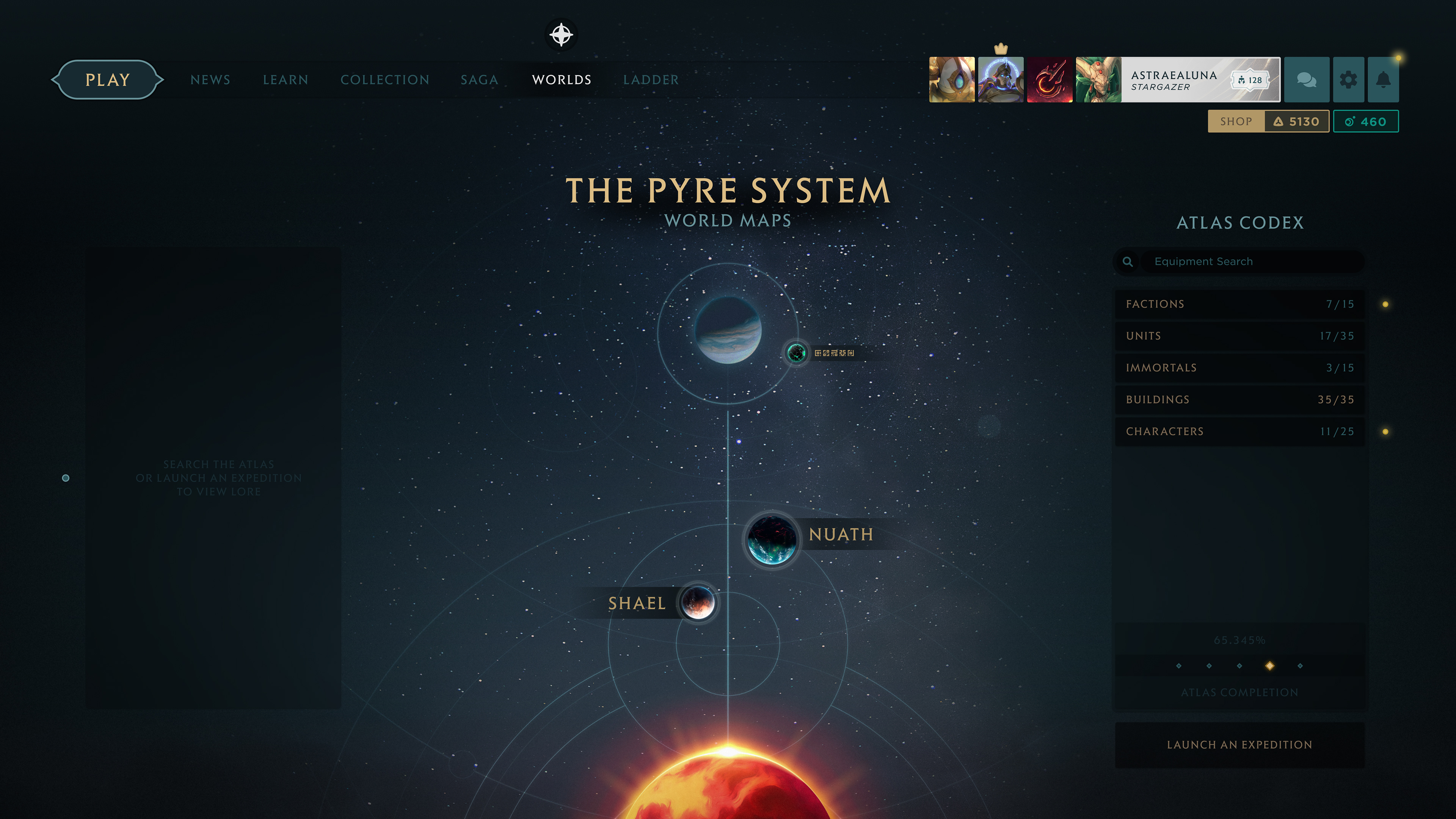
The interface shipped as a genuine extension of the brand I'd built, which is the whole case for putting identity and interface in the same hands. Done that way, the two read as one continuous idea instead of two teams meeting in the middle.
.png)
.jpg)