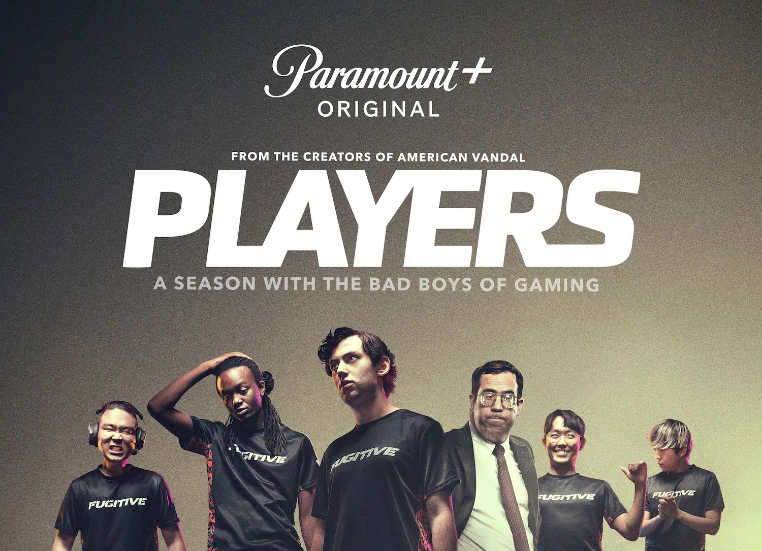
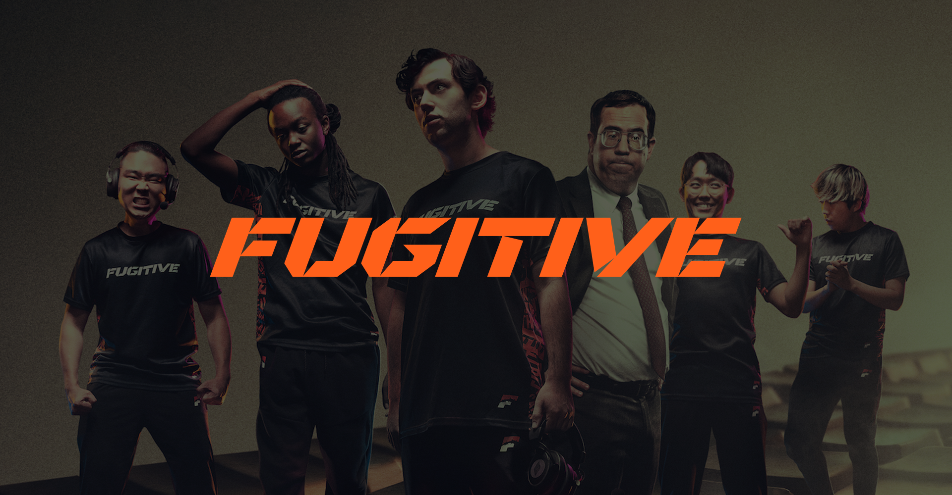
PLAYERS
PLAYERS was a show about esports, which gave the branding a strange job: it had to convince viewers that a fictional org with a fictional history felt real, as though it had actually competed, won things, and picked up the wear of a real competitive life along the way.
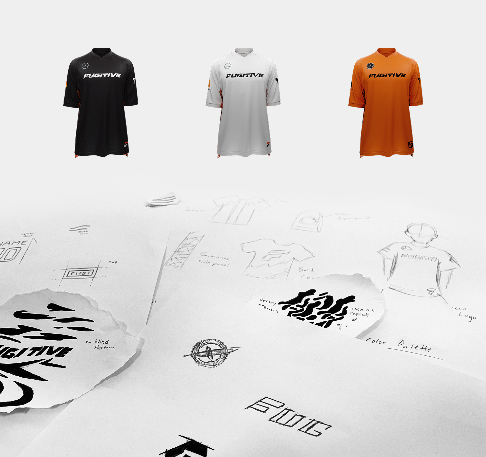
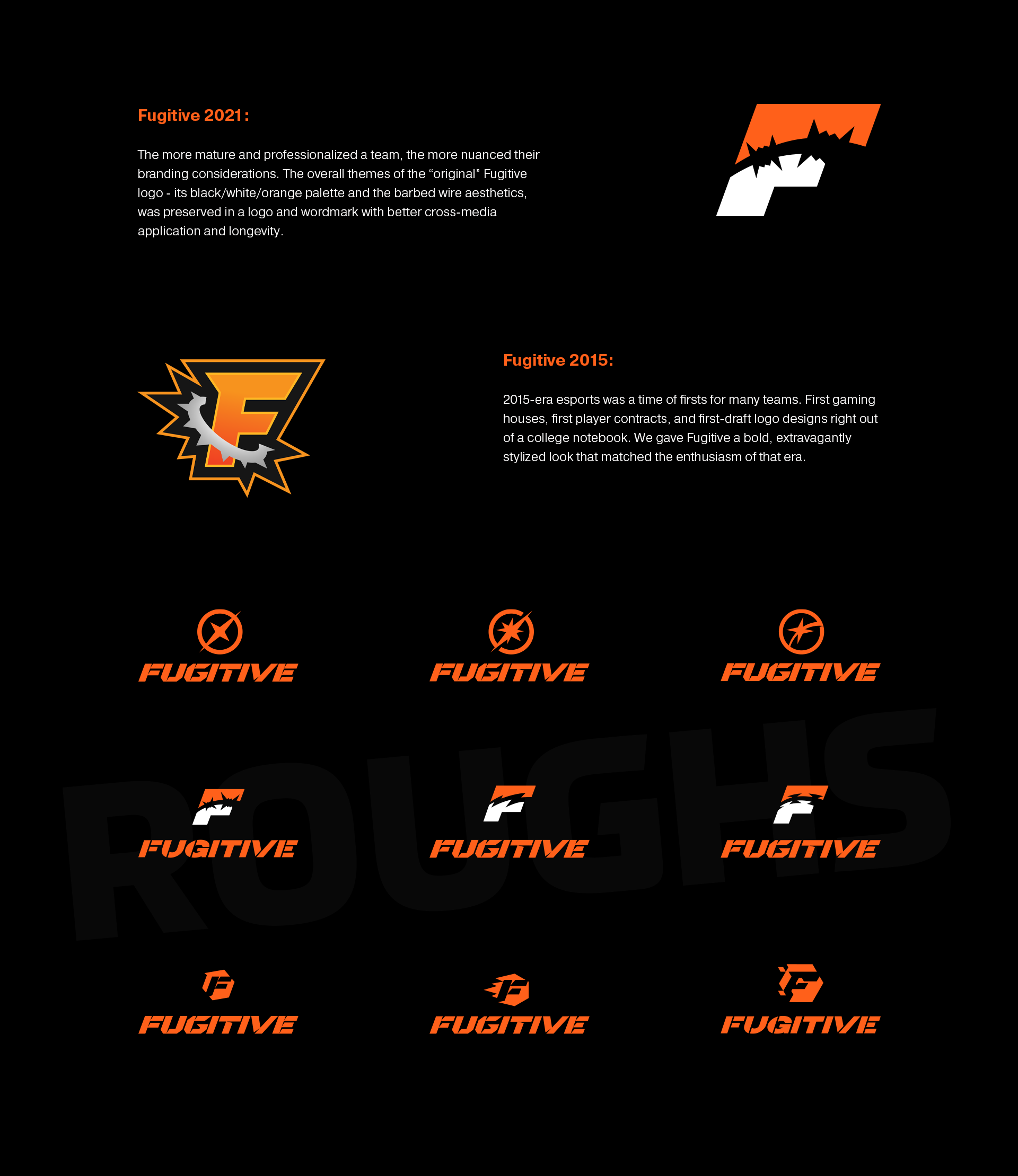
The world depended on believability. The audience needed to accept that this organization had a history, an internal culture, and visual baggage from earlier eras of esports. If the branding felt too polished, too modern, or too obviously made for television, the fiction would weaken. And one requirement made it genuinely odd: the show needed a version of the logo that looked dated, deliberately and convincingly so.
I worked on brand strategy and served as one of the lead designers, but the piece I owned most distinctly was the logo direction, including that deliberately dated mark.
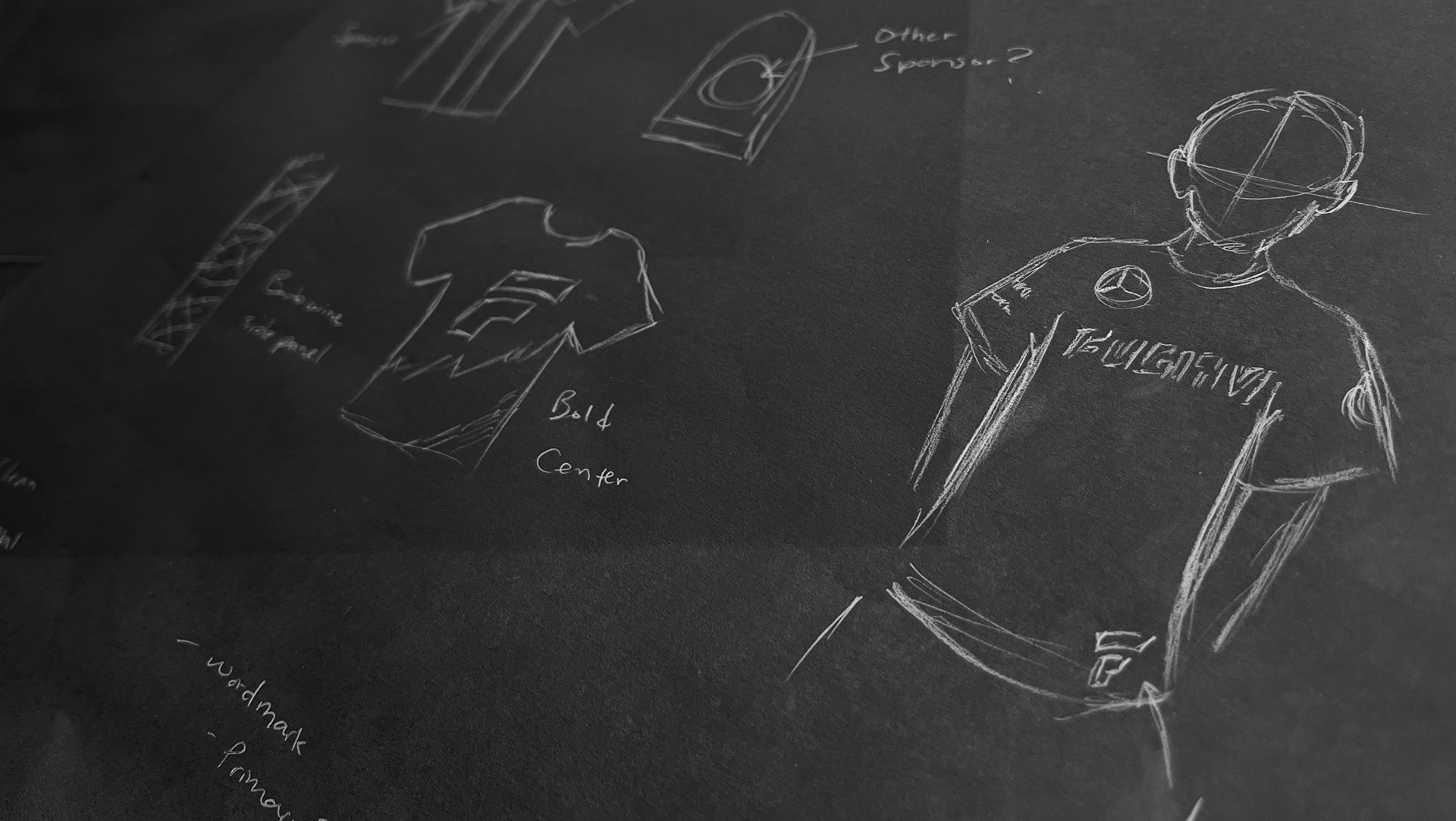
You can't make a logo look old by roughing it up. You have to understand why old esports logos looked the way they did. So I reverse-engineered the era: the conventions, the technical limits, and the slightly over-eager instincts of early esports branding before the field had settled into its own rules. The work ran in two directions at once, a contemporary identity for the show's present and an archival mark that felt authentically of its supposed time.
Designing a deliberately dated logo meant studying how esports brands thought a decade earlier, then designing as if I'd never learned anything since.
The branding sold the fiction. Audiences accepted the world of PLAYERS as lived-in because the design had quietly done the historical homework most viewers would never consciously register, which is usually the point at which this kind of work succeeds.