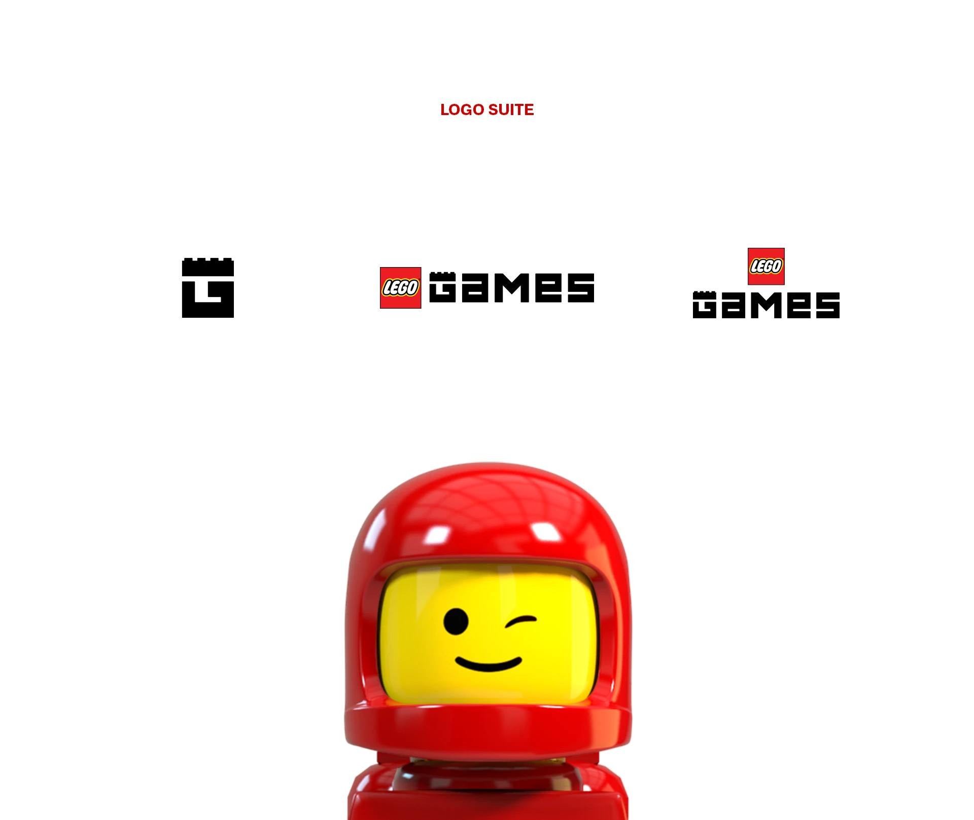
LEGO Games
You don't get to be sloppy with LEGO. It's one of the most disciplined brand systems on earth, beloved across generations, with firm opinions down to the millimeter. Designing inside that world is a privilege and a constraint at once, and that combination is what makes it interesting.
The brief was to create an identity that felt energetic and contemporary enough for games while staying unmistakably LEGO. The brand's recognizability is its greatest asset and the thing you're least allowed to touch. The audience understands LEGO's internal logic intuitively, even if they can't put it into words, which leaves very little room for a wrong move.
I contributed to the brand strategy for LEGO Games and worked as one of the designers on the identity and the logo itself. The key question wasn’t “how do we make this look playful?” It was “what makes this feel structurally true to LEGO?”
That led to the central constraint: the logo follows real LEGO brick proportions. Not loosely inspired by them, built to the actual dimensional logic of the physical pieces. The same geometry that governs a standard brick governs the mark. The rule sounds limiting; it worked the other way. Instead of chasing an open field of options, I designed against a physical truth the audience already understands without being able to name it.
If the mark couldn't plausibly exist as a physical piece, it didn't belong on a LEGO product. That rule kept the work honest.
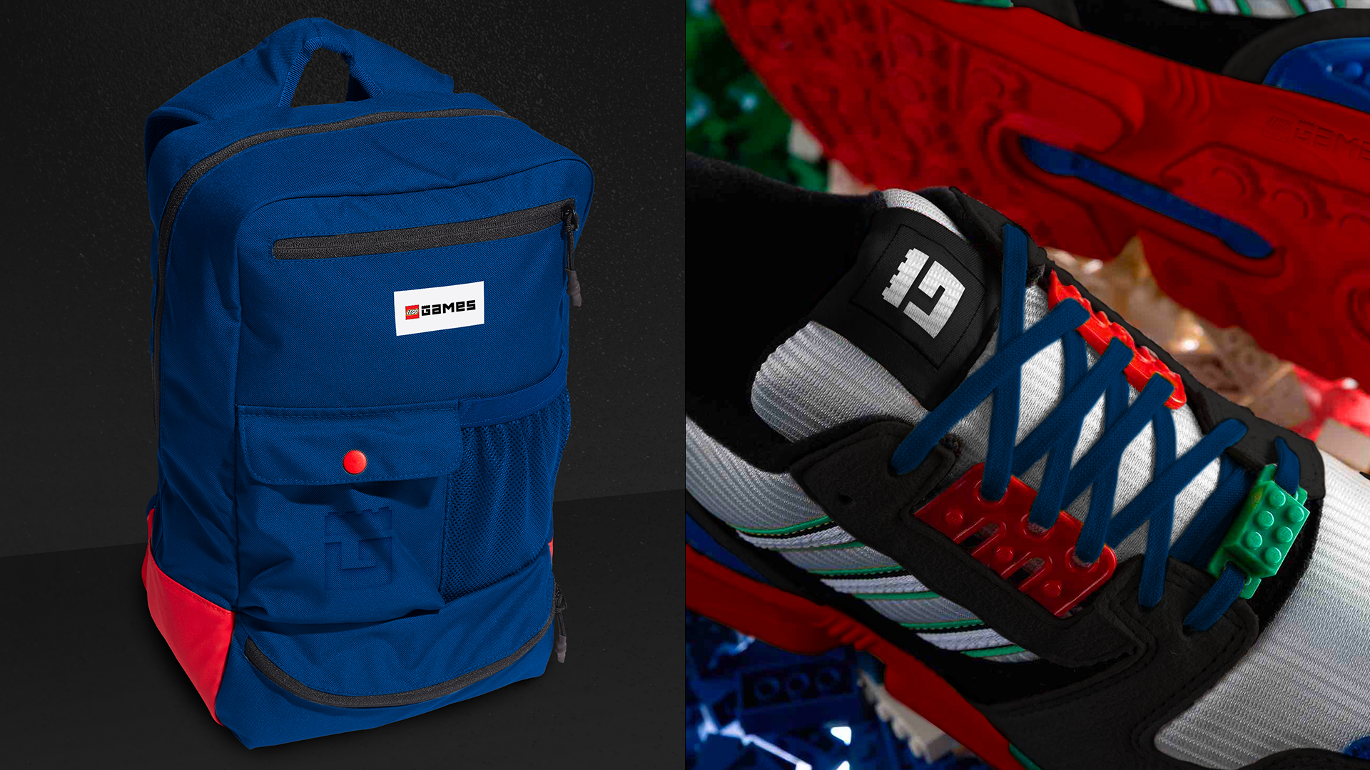
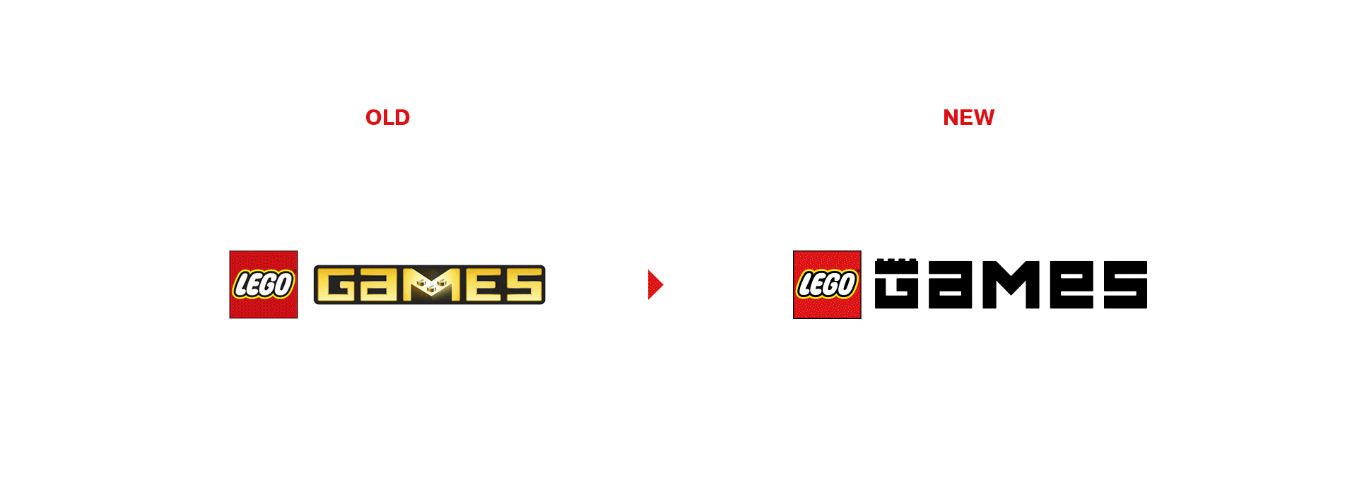
The final identity earned its place in the LEGO universe: playful enough to belong to games, rigorous enough to satisfy the brand, and grounded in the system's own DNA. It feels right even to people who'll never know the reasoning behind it, which is exactly the point.